branding
I design campaigns that give your brand a moment people will remember. Strategic, visually cohesive, and built around what your audience cares about.
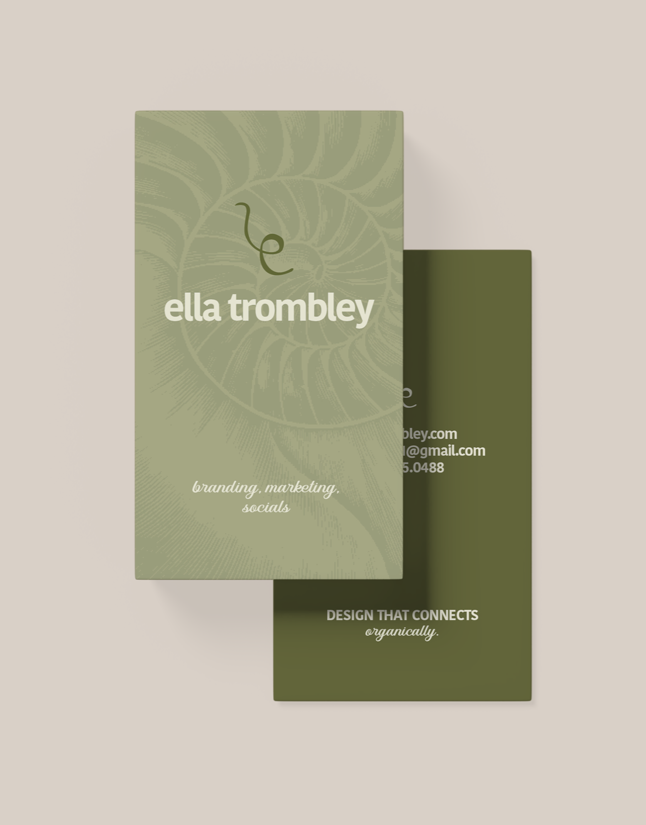
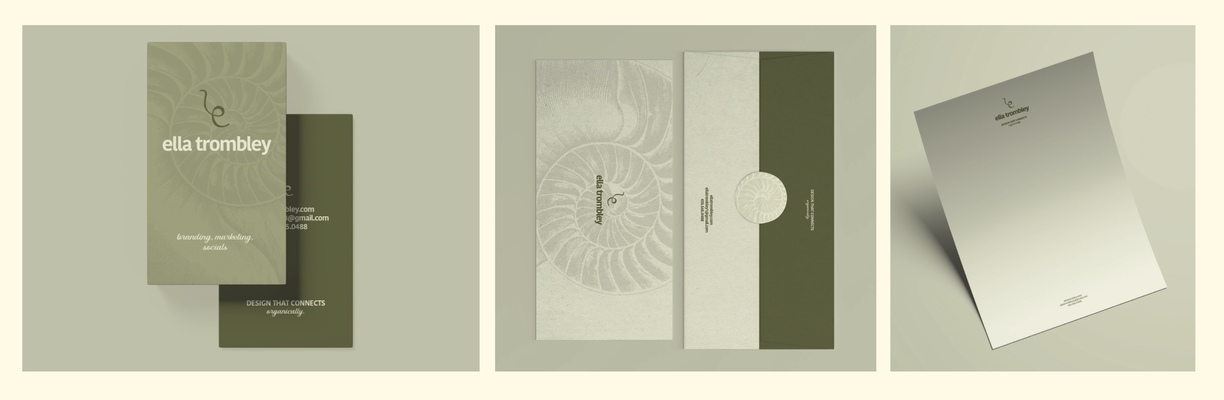
ella trombley
design challenge
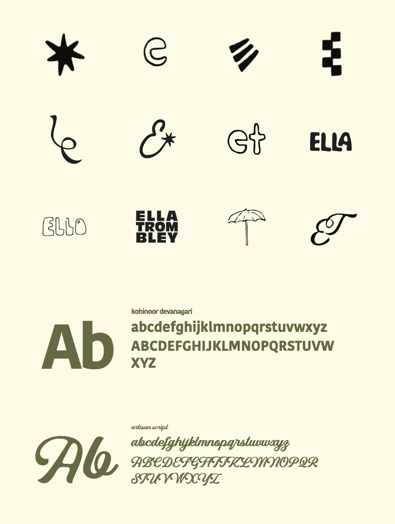
Design your own professional brand identity. It must be distinctive, authentic and memorable to evoke your brand essence. Done well, it will communicate your distinctions and create a competitive advantage. It should describe succinctly who you are, what you do, and what you promise to deliver.
creative solution
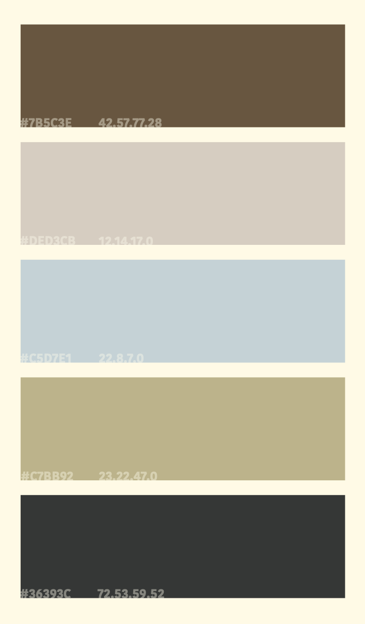
The strategy here centers on communicating an organic, people-first design so it feels approachable without sacrificing professionalism. Exploration of color, typography, and composition drove my creative direction. A friendly, rounded typeface (Kohinoor Devanagari) was selected to signal warmth and clear communication. The color palette (light olive gray and moonlight yellow) was pulled from personal travel photography, grounding the brand in lived experience rather than trend. This gives the system a cohesive visual logic that remains flexible enough to scale across business cards, digital profiles, and broader brand applications. The result is a brand system that positions me as a designer who brings intentionality and personality to every project, which is a differentiator in environments where work can easily feel impersonal.
Client
Self-initiated
Year
2026

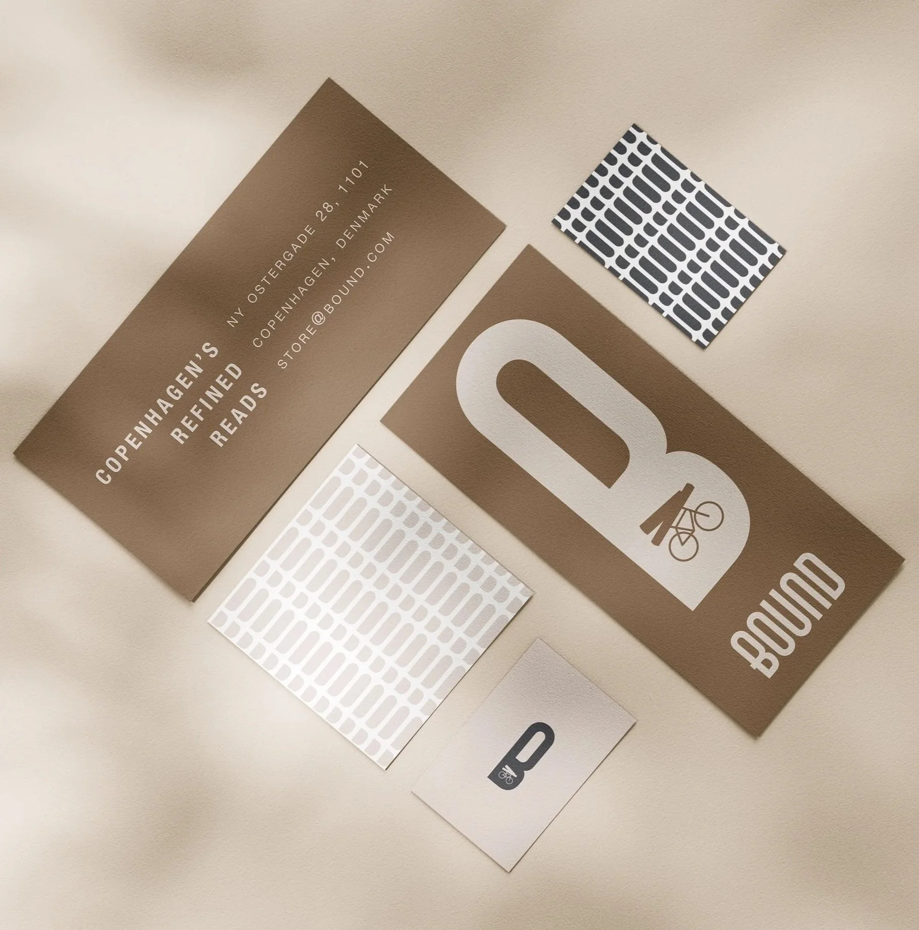
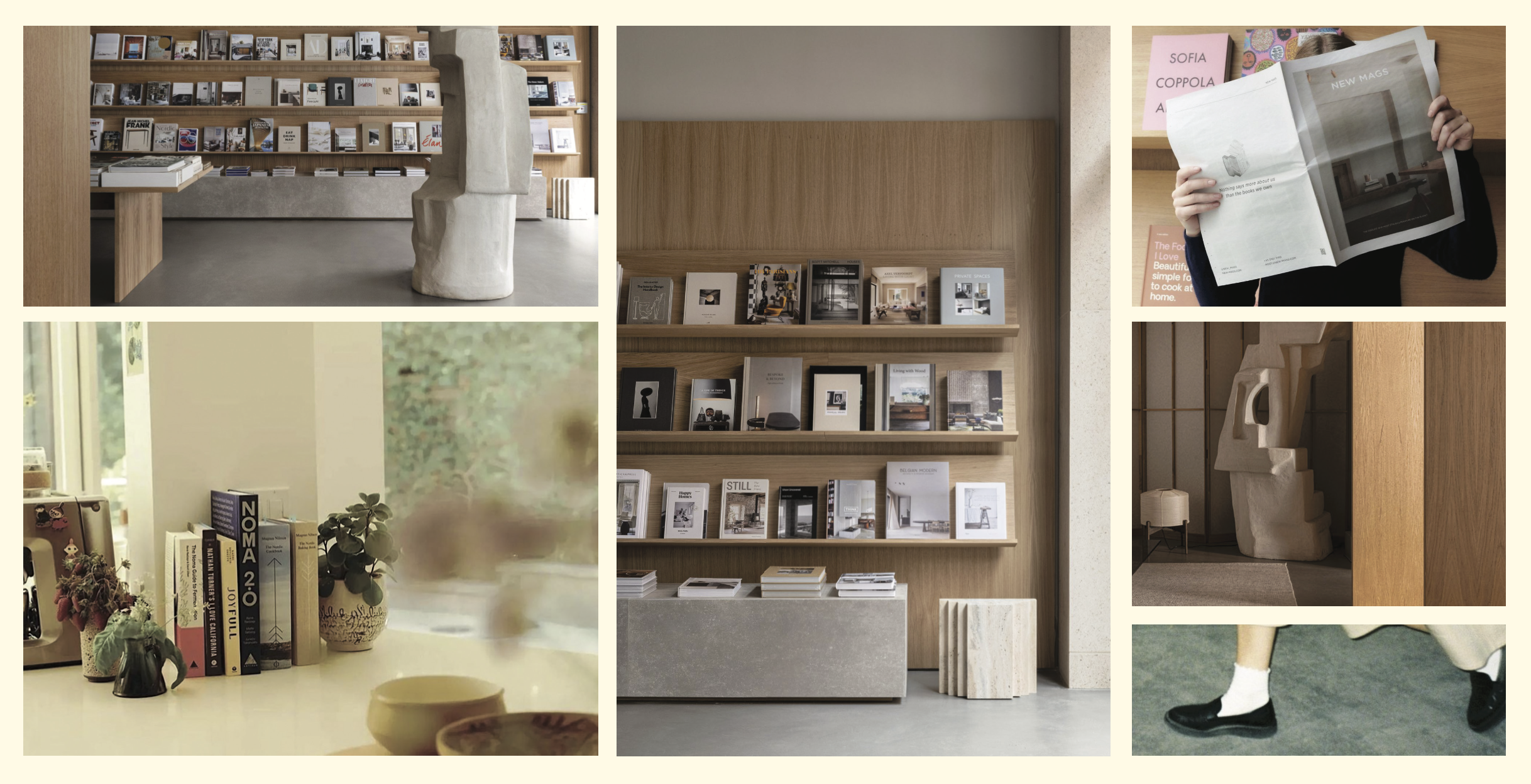
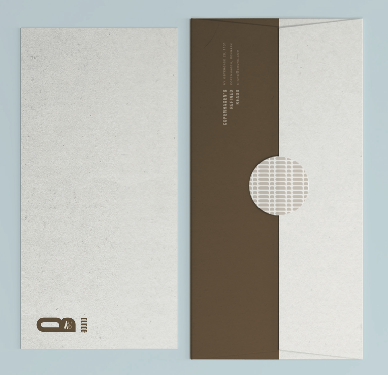
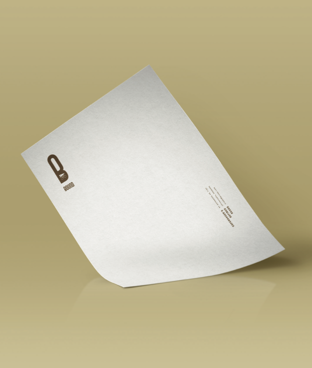
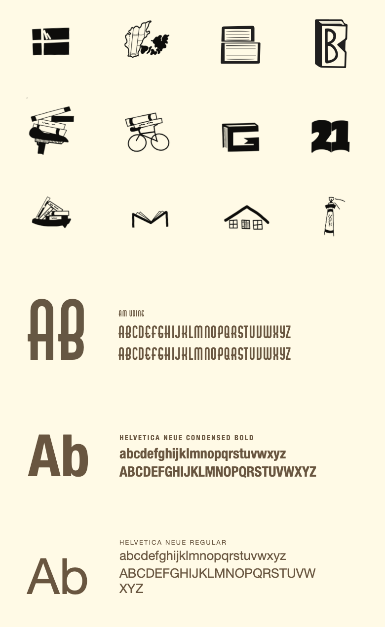
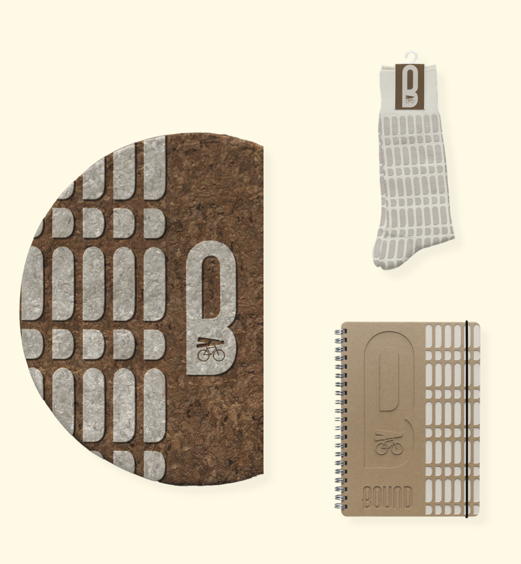
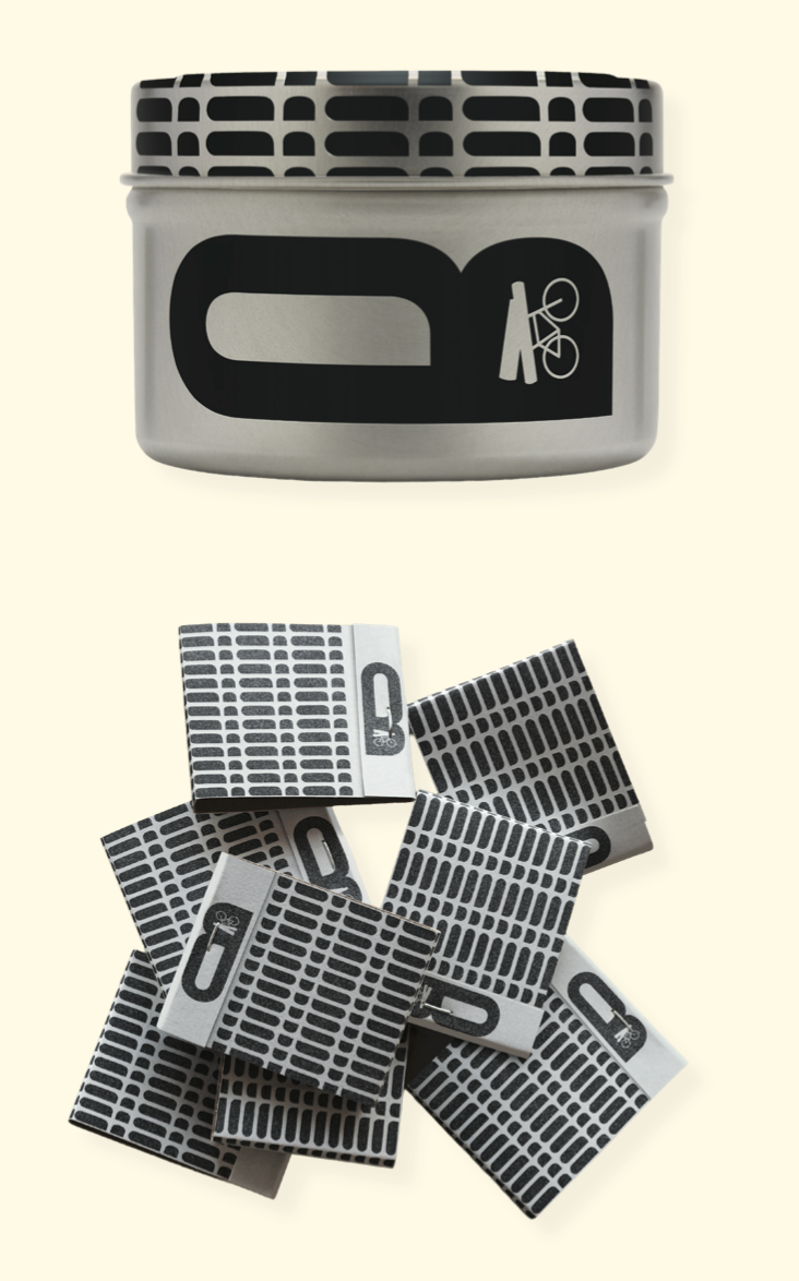
bound bookstore
design challenge
Rebrand an international bookstore of your choice. Use a comprehensive brand design process including research, strategy, design development, application to touch points, and a standards guide. Design the primary identity and apply it to a variety of brand touch points across media resulting in a visually cohesive system. Identify the needs of the client, target audience, and trends to inform your decisions.
creative solution
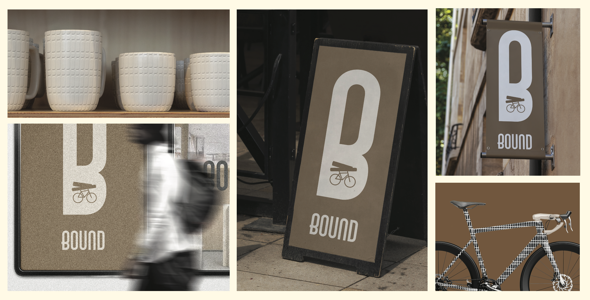
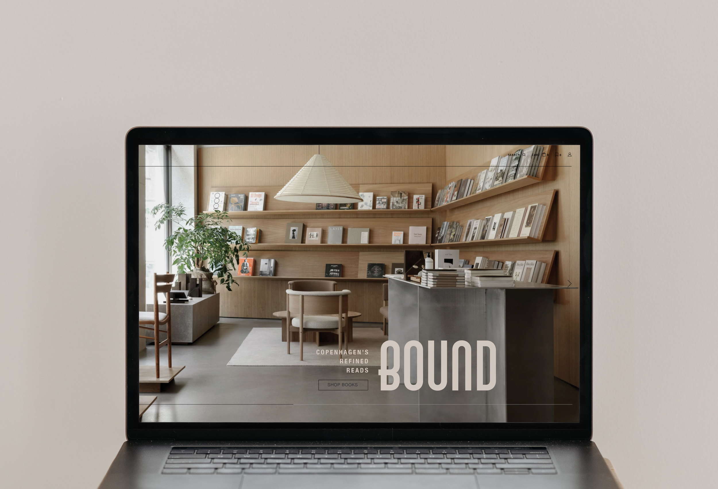
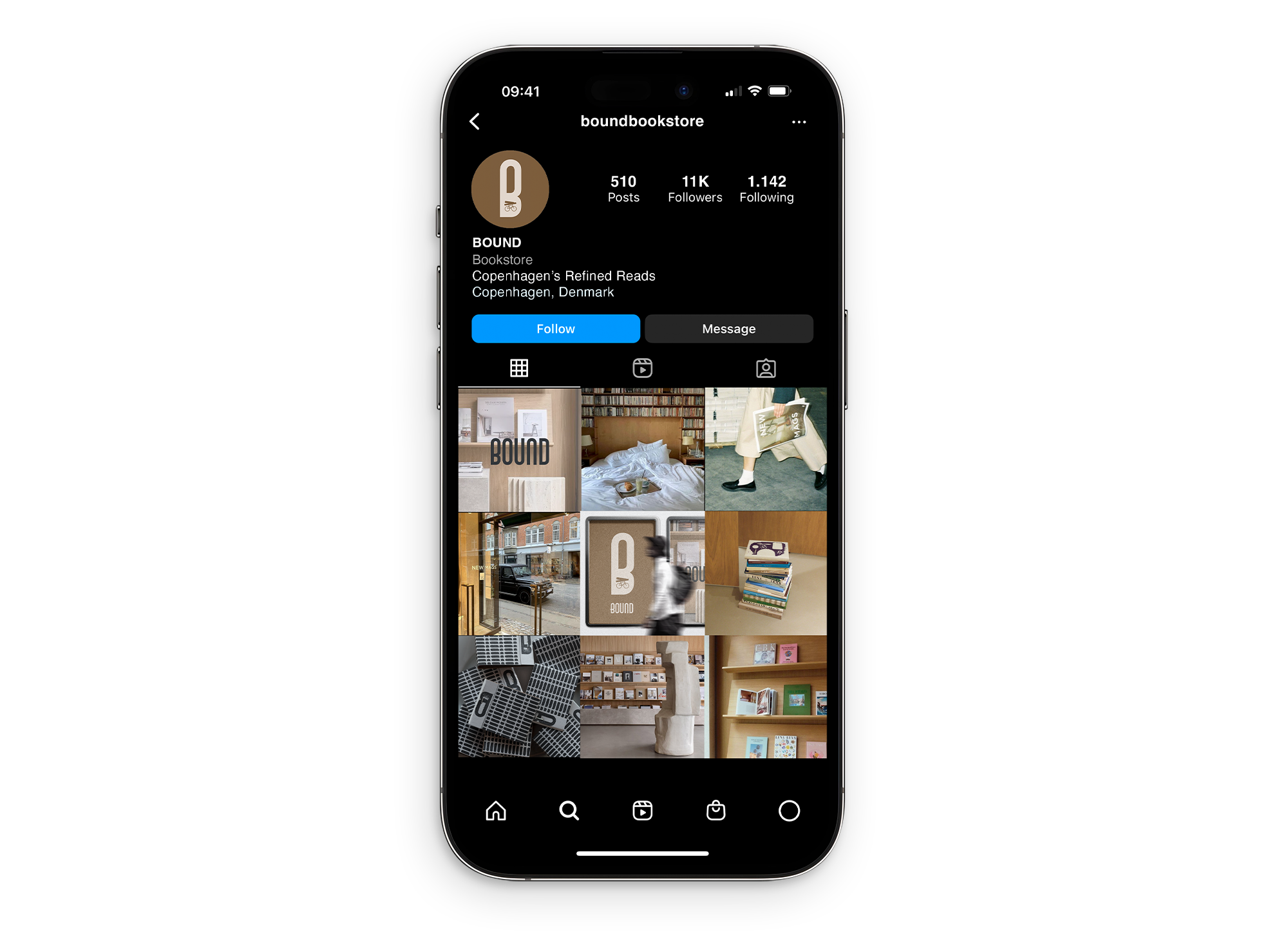
Rebranding New Mags (a curated bookstore in Copenhagen) began with comprehensive brand research and strategy, analyzing the store’s interior, editorial curation philosophy, and position within Denmark’s design culture. Three distinct creative directions were developed, each with supporting naming and tagline strategies, before selecting the strongest concept for full identity development and brand touchpoint application. The chosen direction, Bound, was selected for its layered meaning (books, craftsmanship, and a sense of place), and positions the store confidently within Copenhagen’s refined design landscape. The tagline Copenhagen’s Refined Reads reinforces the store’s intentional, hand-selected inventory, signaling taste and editorial authority to its audience. The visual identity was built around restraint and cultural specificity. A sleek, minimalist typeface reflects the store’s interior of raw wood and cement textures translated into a warm, muted color palette. The logomark emerged from extensive exploration rooted in Danish iconography: a bicycle with books stacked on the seat, integrated into the counter of the B in Bound, grounding the brand in its city without being literal. A supporting pattern system was developed from the same counter forms, scaling across print, packaging, digital, and environmental applications. The result is a cohesive brand system precise enough to feel premium and flexible enough to live across every touchpoint New Mags needs.
Client
New Mags Bookstore
Year
2024