campaigns
I design campaigns that give your brand a moment people will remember. Strategic, visually cohesive, and built around what your audience cares about.
creation care
design challenge
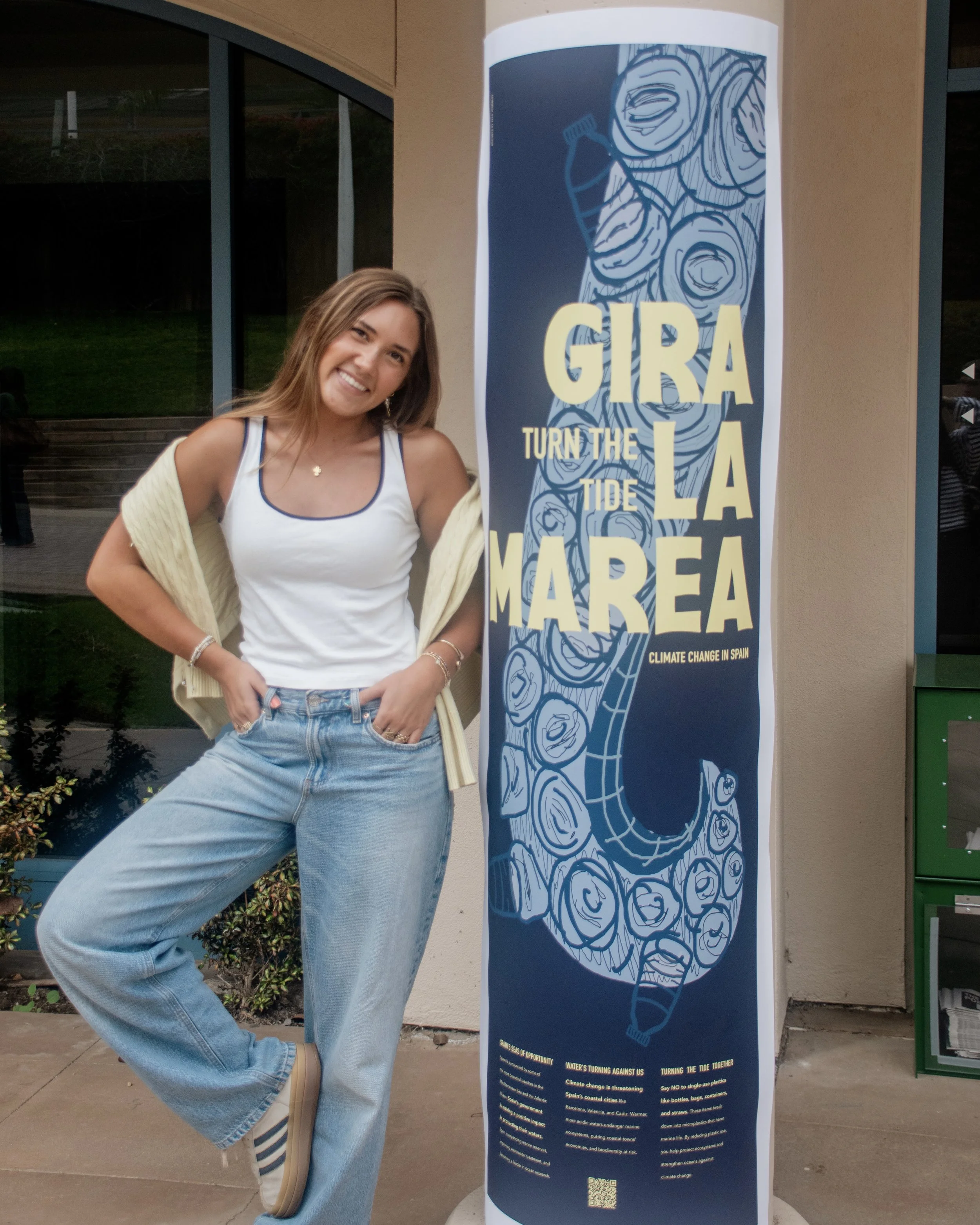
Team up with the PLNU Office of Sustainability to promote Creation Care Week. The goal is to engage the Point Loma Nazarene University campus community, spark conversation, and create a call to action so people can get involved. Use Design Thinking’s human-centered research approaches and methods to create an awareness campaign on climate change. Explain what is being done to mitigate climate change in this country and what individuals at PLNU can do to help make a change. Use personal social science research findings to create a conversation about climate change in our community effectively.
Client
Point Loma Nazarene University’s Office of Sustainability
Year
2026
creative solution
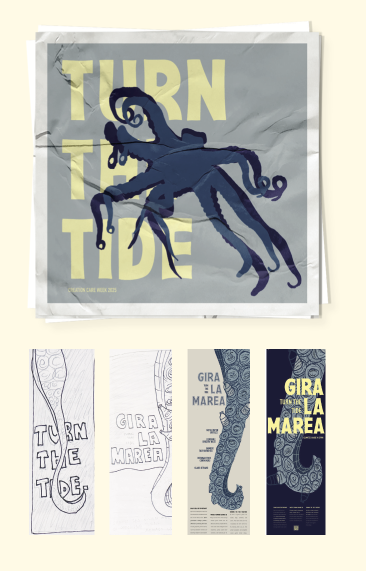
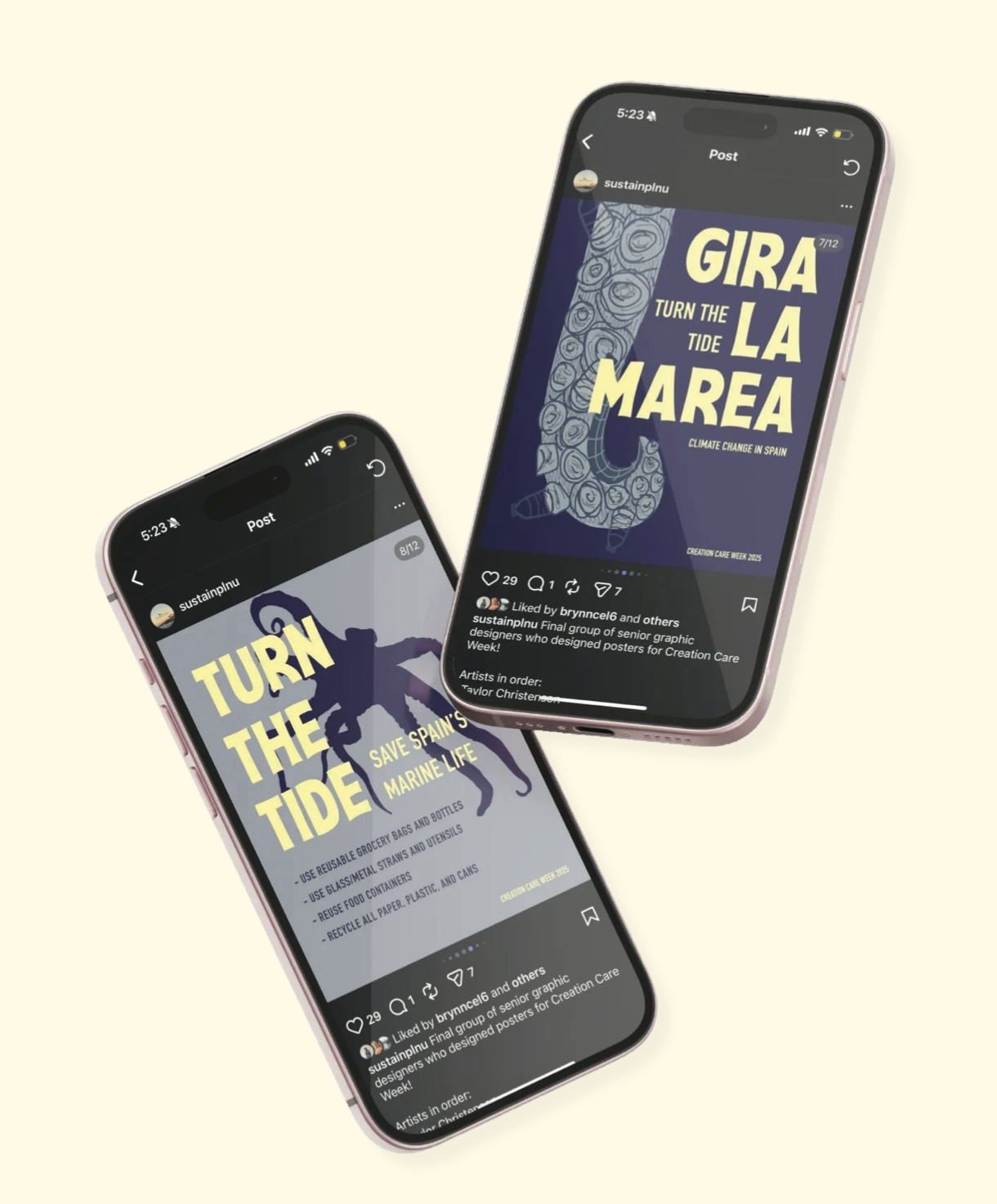
This campaign poster targets environmental awareness around plastic pollution in Spain’s marine ecosystems. The central illustration is a hand-drawn octopus tentacle, chosen for its visual tension and symbolic weight. Plastic bottles emerging from the suction cups directly implicate human consumption in marine destruction, making the environmental threat cut deep rather than abstract. The headline Gira la marea (“turn the tide” in English) functions as both a call to action and a nod to the Spanish language. Copy at the base of the poster moves viewers from awareness to action, covering the scope of Spain’s climate challenges, current mitigation efforts, and concrete steps individuals can take. This design was made as a scalable campaign system rather than a standalone piece. A QR code extends the poster’s reach digitally, while a companion sticker series featuring the octopus silhouette and “Turn the tide” ensures the message travels beyond the poster. This reinforces brand cohesion and keeps the cause visible in everyday spaces.
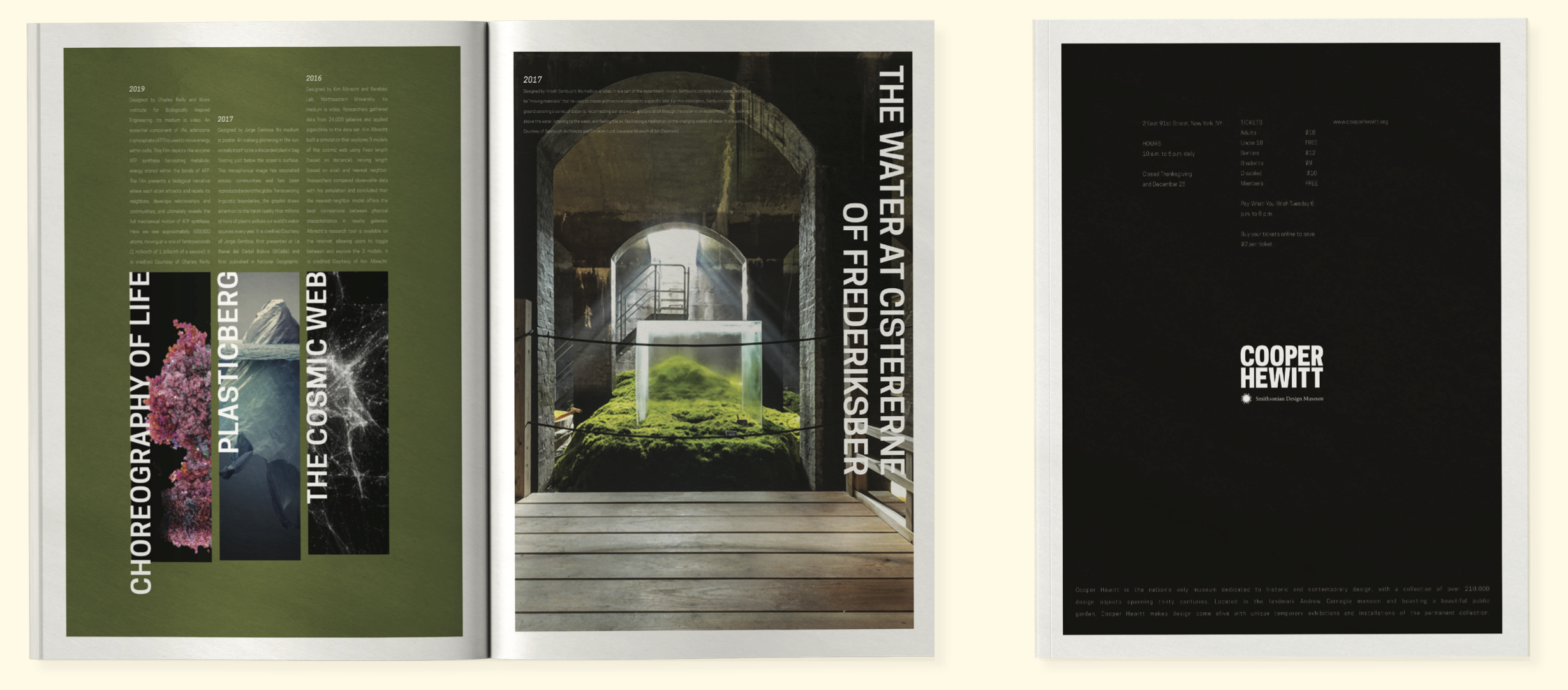
cooper hewitt
design challenge
Design a print publication to help the Smithsonian’s Cooper Hewitt Museum promote an exhibition collection of your choice. Assess the message, curate a selection of images, and do research to inform your design direction.
Use Adobe InDesign to create a cohesive visual system of type, image and message. Consider the narrative flow and movement through the publication. Be mindful of the target audience, as well as the Cooper Hewitt’s brand identity. Design multiple iterations and refine until you have achieved dynamic layouts with good compositional balance, structure, and clear visual hierarchy.
Client
Smithsonian’s Copper Hewitt Museum
Year
2023
creative solution
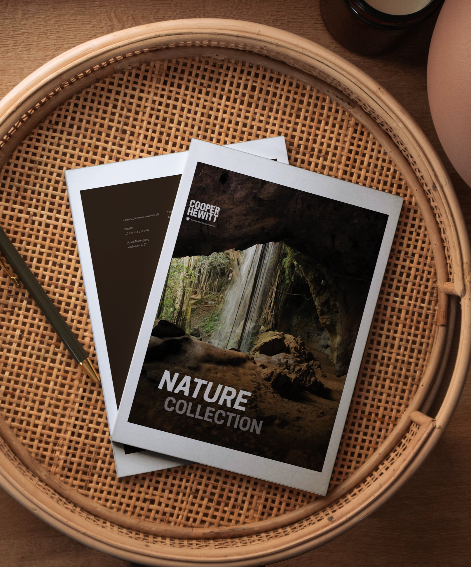
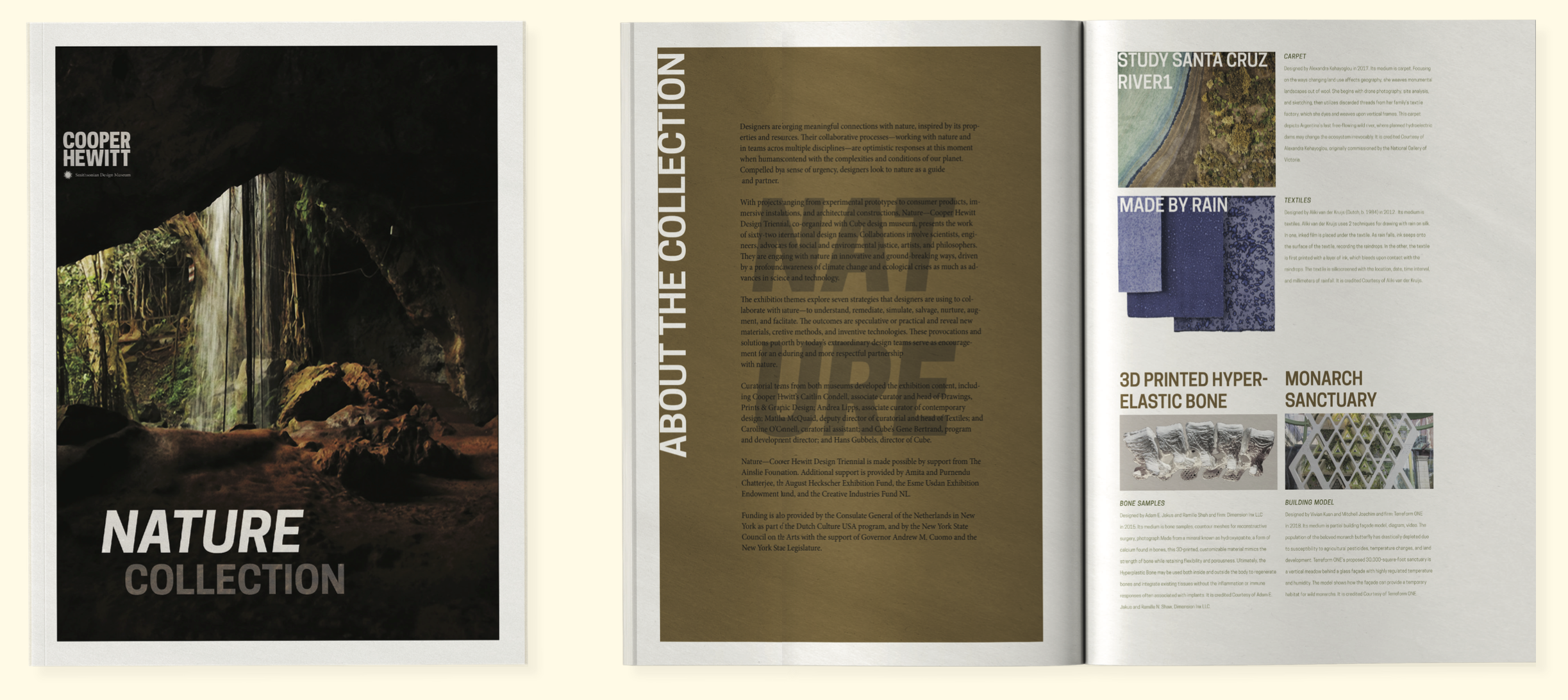
Research into the Cooper Hewitt Nature Collection shaped every decision in this campaign. After studying the museum’s brand guidelines and curating an image library drawn from the collection itself, the creative direction emerged: let the artifacts lead. Cooper Hewitt’s typography is clean and authoritative, so the design strategy leaned into bold, colorful imagery from the collection to create visual energy within a restrained typographic system. The color palette was drawn directly from natural forms found across the collection, which grounded the campaign in the exhibit’s subject matter while staying cohesive with the museum’s established identity. Each spread was designed with intentional variation in layout and visual weight to sustain engagement across multiple pages, rewarding viewers who move through the publication rather than losing them early. The back of the publication contextualizes the experience, housing information about both Cooper Hewitt and the Nature Collection to orient new audiences and deepen the connection for returning visitors. This publication has a visual language flexible enough to extend across digital, environmental, and promotional media while keeping the Nature Collection’s identity consistent throughout.
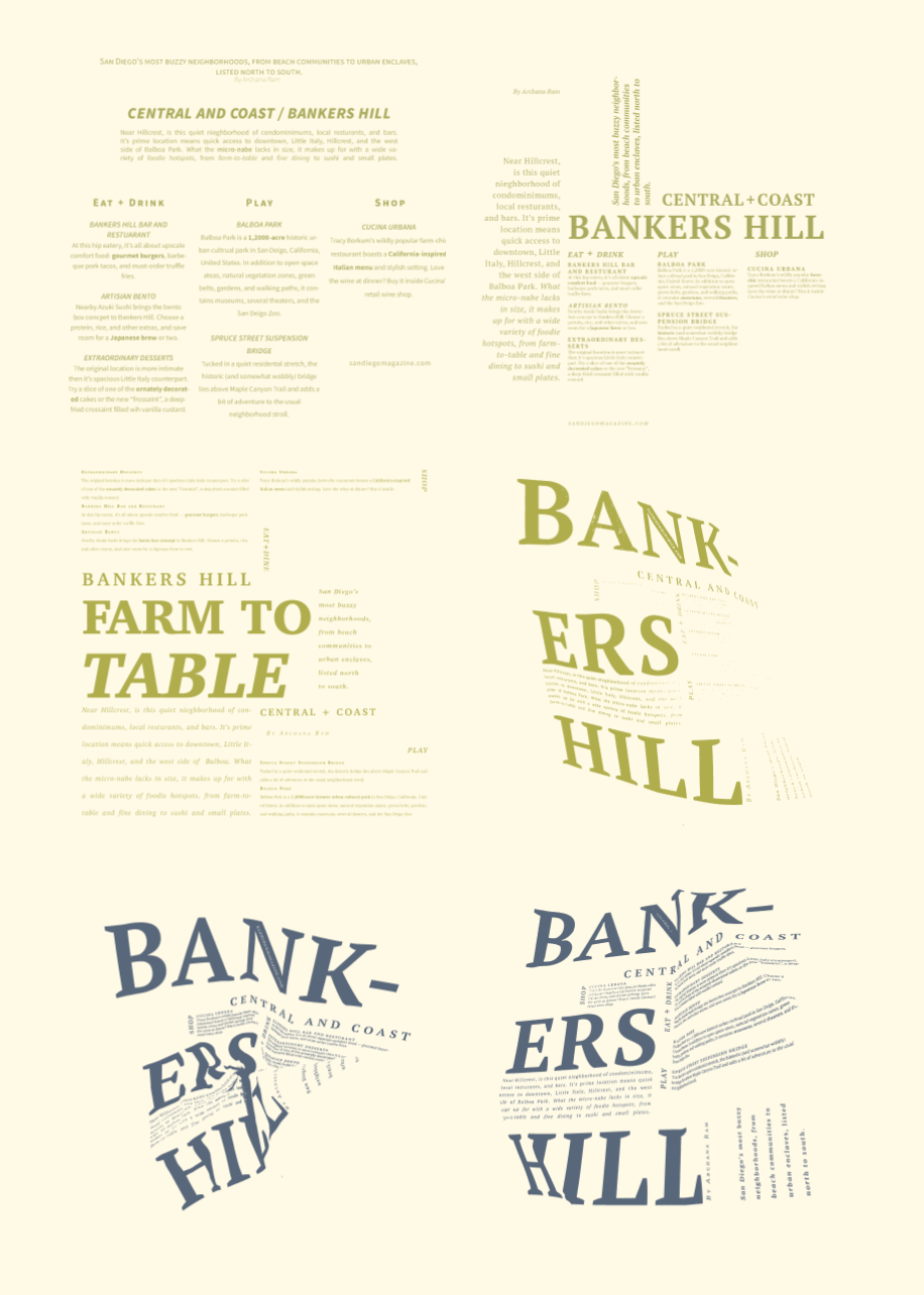
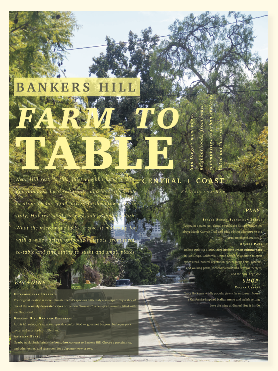
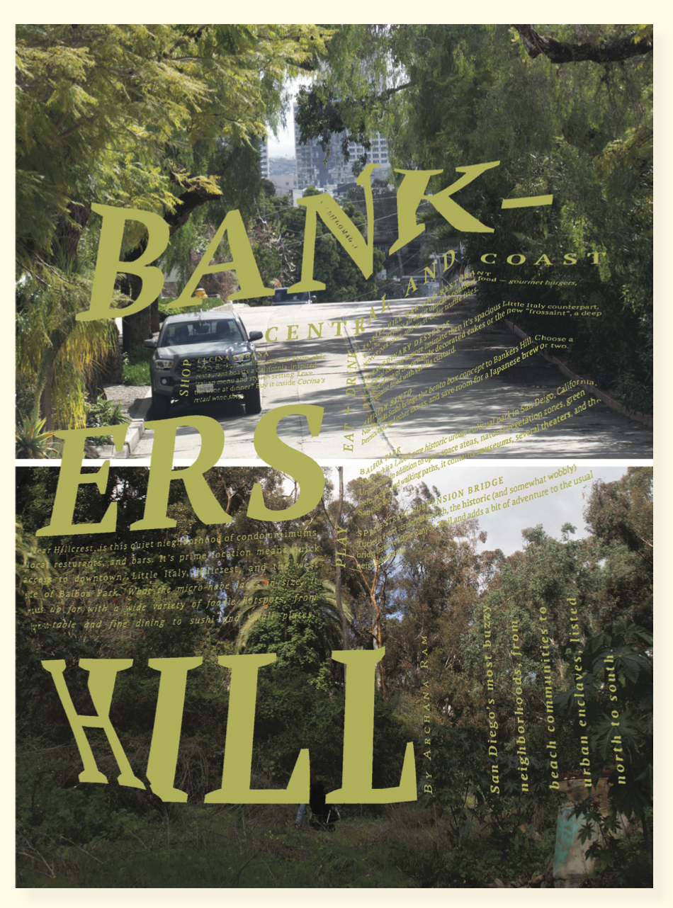
bankers hill
design challenge
Promote public interest in a San Diego “Buzzy” Neighborhood of your choice. Explore experimental approaches to poster design and layout. Use type, image and message to convey the tone and spirit of the area. Employ a modular grid, best typographic practices, and design principles to create dynamic layouts. Posters will be displayed in public.
Client
Bankers Hill, San Diego
Year
2023
creative solution
This poster campaign began with original photography shot on location in Bankers Hill, San Diego. Which is a neighborhood with a distinctly eclectic character that sets it apart from the rest of the city. The creative strategy centered on capturing that energy authentically. The design process was iterative and methodical: alignment compositions were developed and sprint-tested first, followed by hierarchy explorations, then extreme scale studies. Printed alignments were then crumpled, scanned, and converted into bitmap TIFFs — a tactile, process-driven technique that introduced raw texture and visual tension directly into the imagery, reflecting Bankers Hill’s layered, unconventional identity. Color was pulled from the photography itself, with green and yellow emerging as the natural palette — keeping the poster grounded in the place it represents. The result is a typographic and photographic system that translates a neighborhood’s personality into a cohesive visual language.
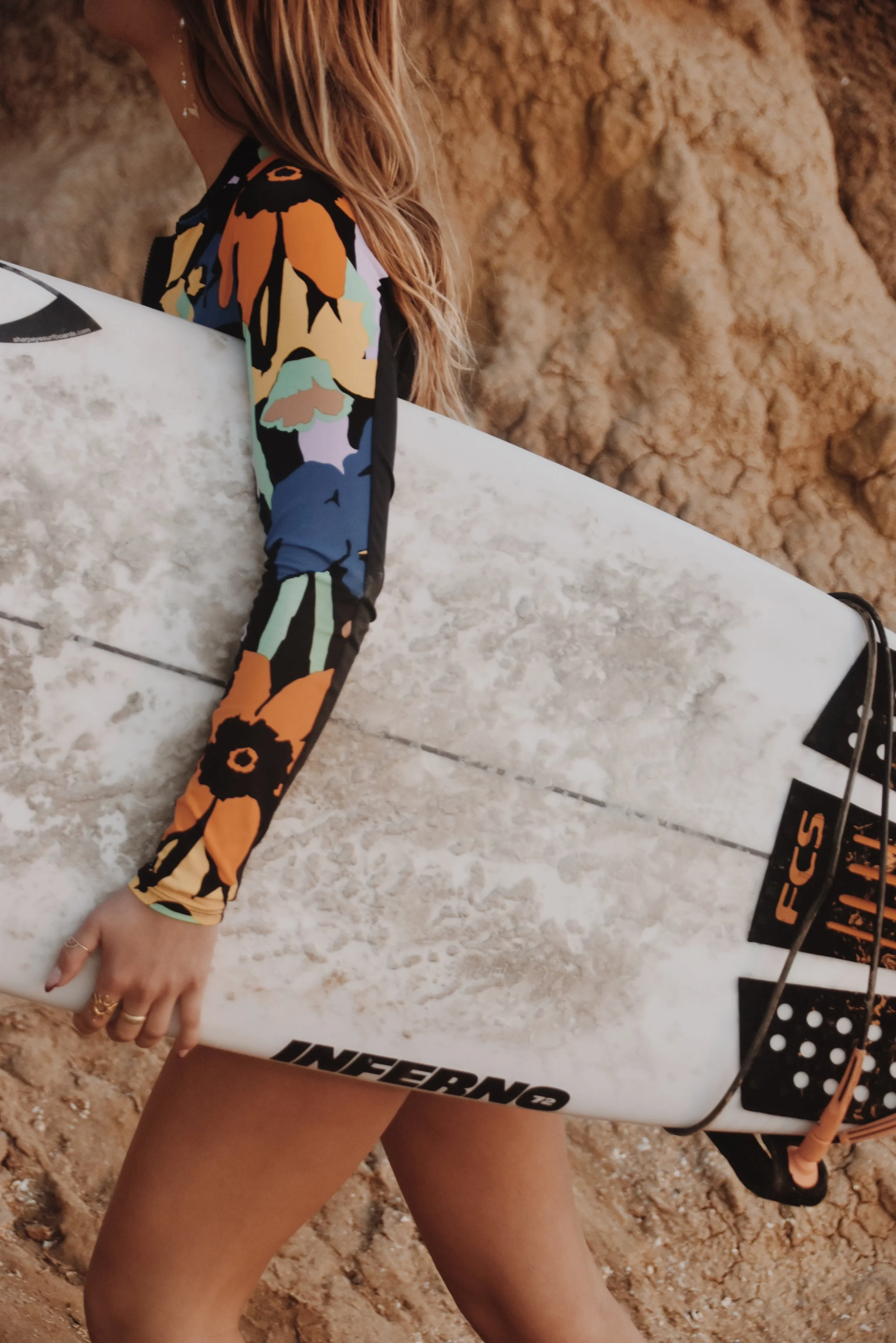
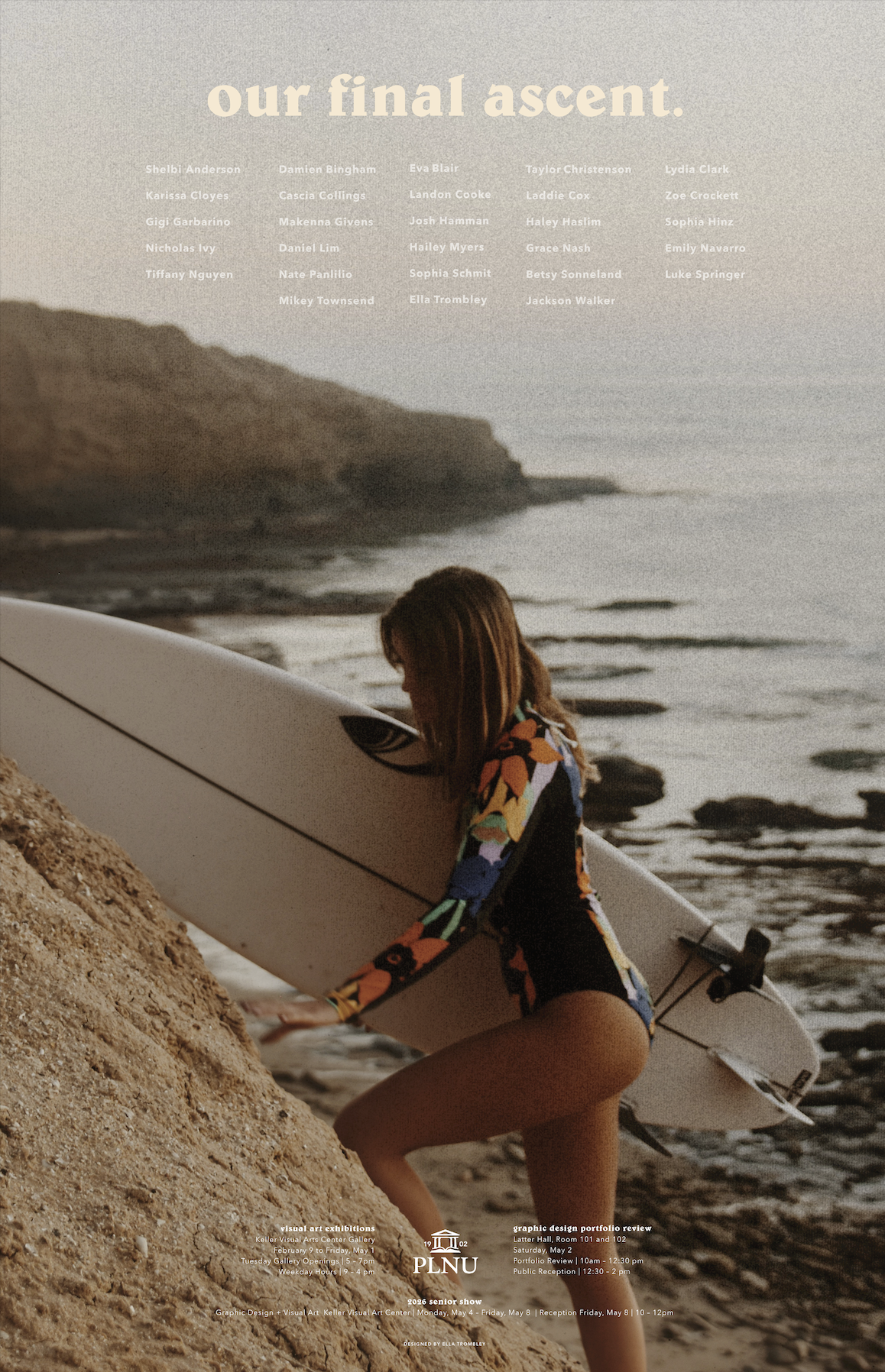
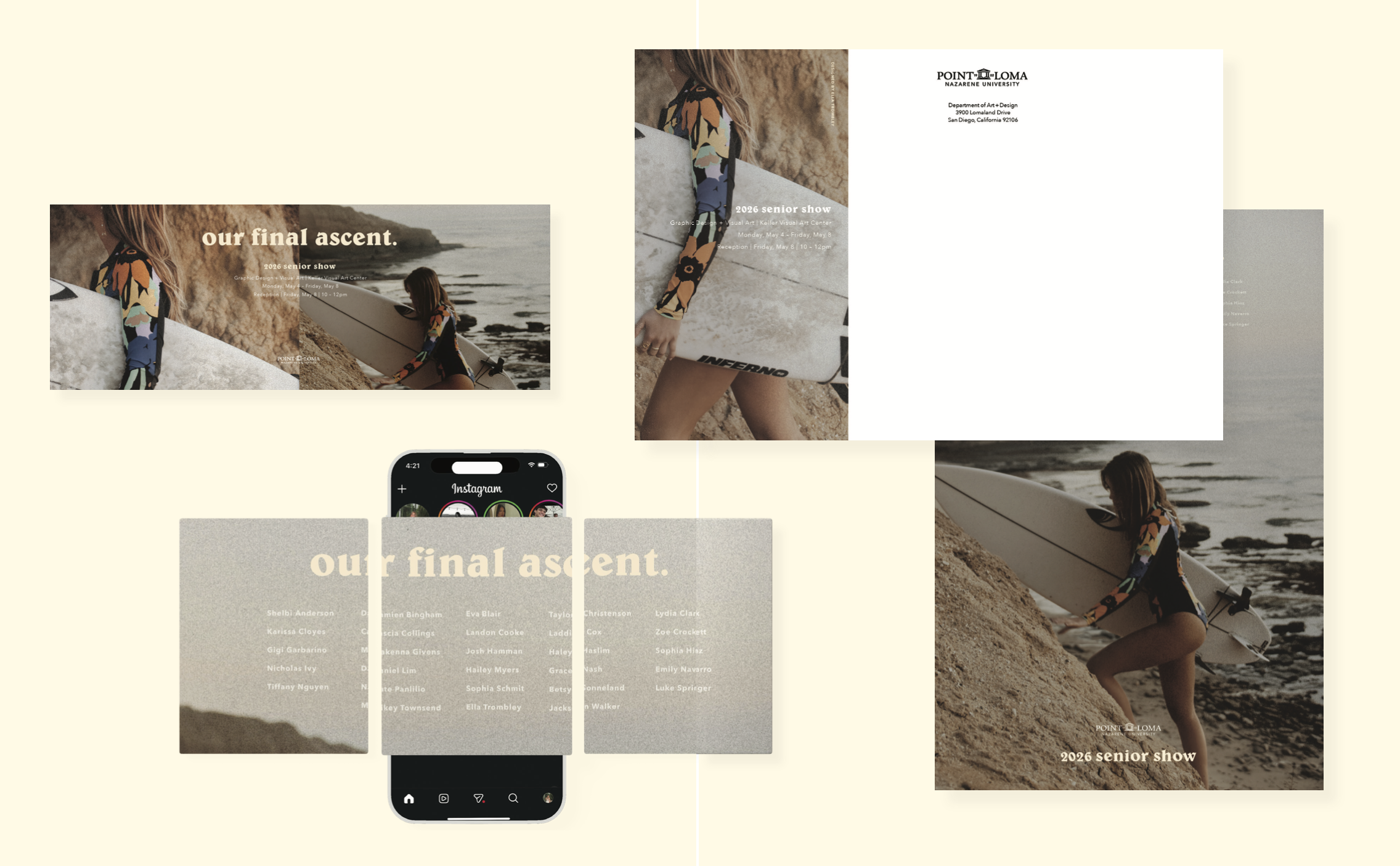
2026 senior show
design challenge
Design an engaging and visually cohesive event identity across media announcing Point Loma Nazarene University’s 2026 Senior Show. It must celebrate the Graphic Design and Visual Arts students and their senior capstone work. The design must inform and convey the spirit of PLNU and its graduates.
Client
Point Loma Nazarene University’s Art and Design Department
Year
2025
creative solution
My strategy was centered on creating an emotional connection with my specific audience: PLNU design students approaching graduation. The creative direction draws from Patagonia’s visual language, including high-contrast photography, bold typography, and a sense of adventure reframed through a coastal lens to resonate with the university’s coastal identity. Original photography was shot on location at Sunset Cliffs, of a student with her surfboard. This image was chosen for its dual meaning. Surfing culture speaks to the broader PLNU community, while the elevated coastal setting reinforces the poster’s headline, (Our Final Ascent), positioning graduation as both an achievement and a threshold. Photos were edited to emulate film photography, a deliberate choice to evoke nostalgia and signal that this moment is worth remembering. Artist names are prominently featured near the top of the composition, reflecting the belief that people are the focal point of any event. Supporting information is at the bottom of the layout, organized around the official PLNU logo to maintain institutional credibility. This poster system balances emotional resonance with clear hierarchy, designed to stop someone mid-walk and feel personally addressed.